THE CHALLENGE
Kelsey had been putting off a redesign because she kept second-guessing every choice. Colors, fonts, words, layout: each decision opened three more. That is paralysis by analysis, and it is incredibly common with business owners who care deeply about getting it right.
Meanwhile, the old site was quietly underselling her:
- It lived under her previous practice name, Kelsey M. Buccelli, CPA, LLC, rather than a brand she could grow into.
- The homepage was a single formal paragraph and a business-hours table, with one generic headline: "Accounting and Business Solutions for Entrepreneurs."
- Nothing on it captured her personality, her plain-English approach, or the proactive, year-round way she actually works with clients.
- There was no clear path for a visitor to understand her services, see who she helps, or know what working together costs.
For a solo CPA, the website is often the first conversation a prospective client has with the firm. Hers was saying "accountant." It needed to say "Kelsey."
THE MISSION
Build a brand and website that:
- Feel unmistakably like Kelsey: warm, sharp, and refreshingly jargon-free.
- Break the mold of the typical accounting website without sacrificing trust or professionalism.
- Make the path from "I should probably deal with this" to "booked a consultation" as short as possible.
- Give her a foundation for SEO and ongoing updates as the practice grows.
And just as important: make the process easy. Simplify every decision, guide her through each one, and keep the momentum going.
BEFORE AND AFTER
The fastest way to see the transformation is side by side.
A note on the "before": public web archives saved the old site's text but not its design, so we are describing it in words rather than showing a broken screenshot. It was a perfectly fine template site. It just was not her.
POWERS DEPLOYED
This was a full-roster mission. We started with a working session focused on Kelsey herself: how she talks to clients, what they thank her for, and what makes her different from the CPA down the street. Everything else was built on that.
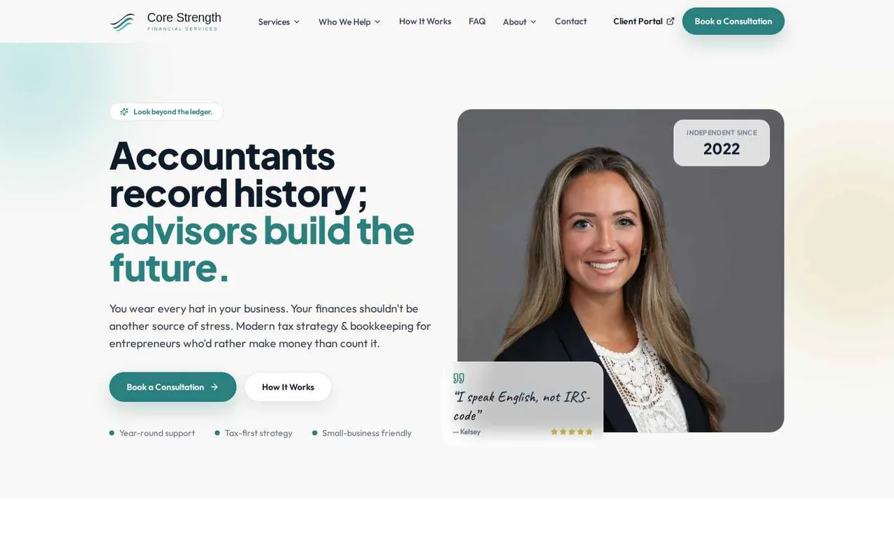
- Rebrand: a new name presentation, logo, color palette, and fonts that feel calm and trustworthy without feeling stiff.
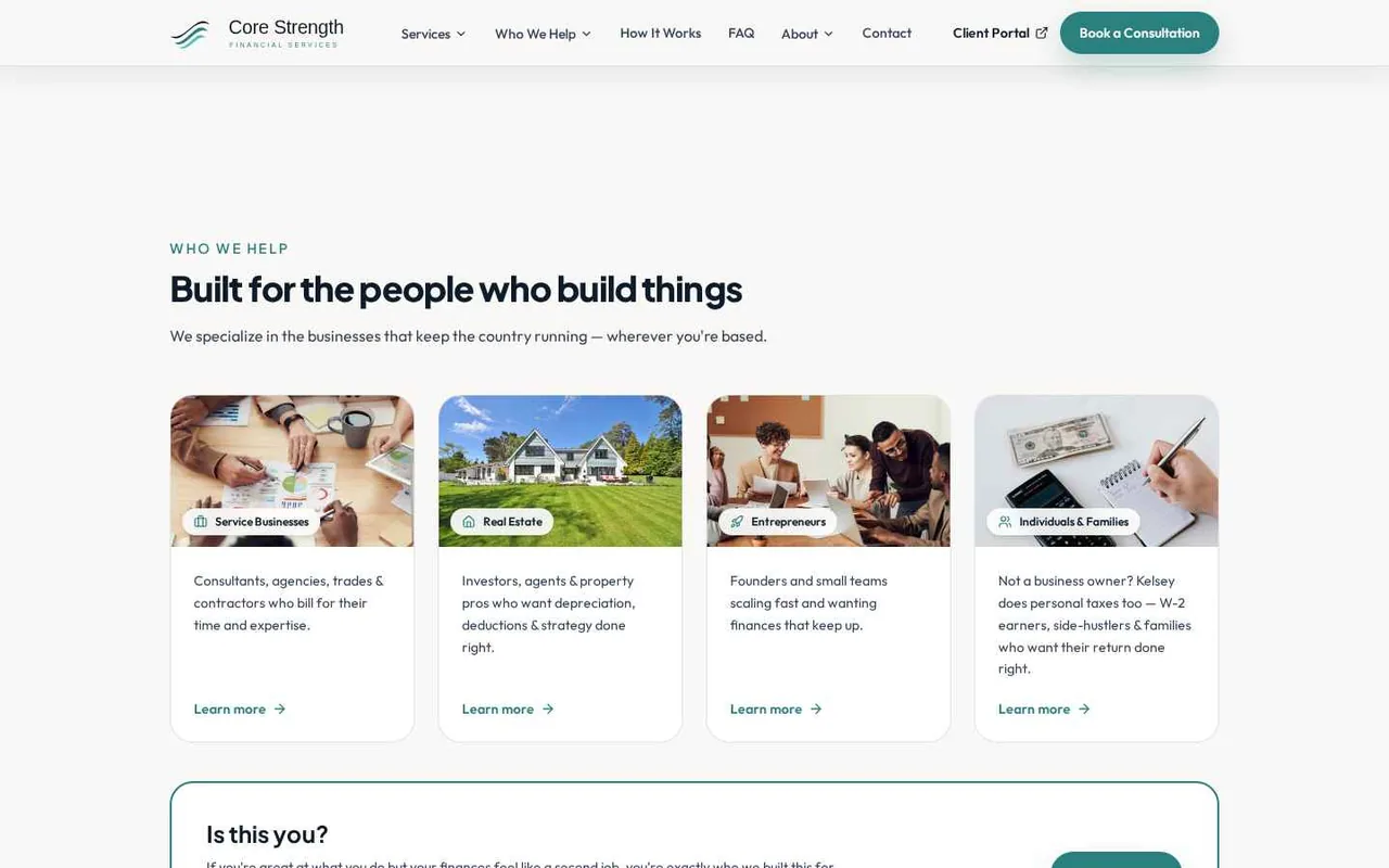
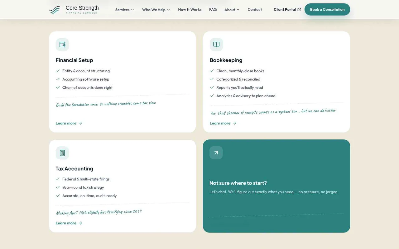
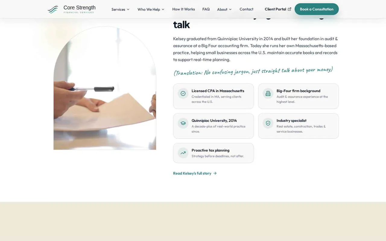
- Copywriting in her voice: every headline, service description, and FAQ written to sound like Kelsey talking across the table, down to the handwritten asides.
- Custom website design and build: an editorial layout with a split hero, arched imagery, service cards, audience pages, a three-step "How It Works," and a clear service menu.
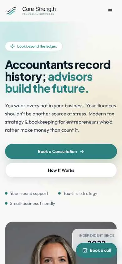
- Conversion paths: "Book a Consultation" calls to action throughout, a sticky mobile booking button, and a direct link to her secure client portal.
- SEO foundations: clean page structure, descriptive titles and metadata, and dedicated pages for each service and audience she serves.
- Ongoing care: updates, SEO, and whatever comes next, handled by the same team that built it.
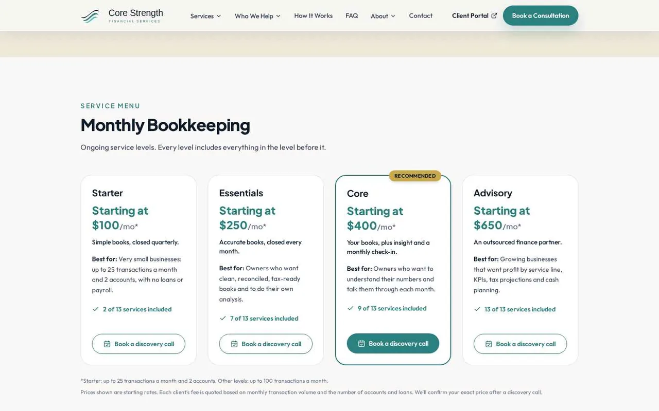
Throughout, the job was to simplify. We narrowed choices down to a few strong options, explained the tradeoffs in plain terms, and kept the project moving so the second-guessing never had a chance to set in.
BUILT FOR EVERY SCREEN
Most of her future clients will meet Kelsey on a phone, between jobs or on a lunch break, so the mobile experience got as much attention as the desktop one.
THE HEROIC VICTORY
The new brand and website launched on November 13, 2026.
The site is brand new, so traffic and lead numbers are still to come. The early verdict comes from the person who matters most.
WHY IT WORKED
Professional services firms often assume they have to look like everyone else in their industry to be taken seriously. The opposite is usually true. When every CPA website says "comprehensive solutions," the one that sounds like a real person is the one people remember and call.
This project worked because we started with Kelsey, not with a template. Her voice, her approach, and her personality drove the brand, the words, and the design. Then we made the process simple enough that she could actually get it done.
WHAT COMES NEXT
Launch day is the starting line. We are continuing to work with Core Strength on site updates and SEO, so the new brand keeps getting found by the small businesses, real estate pros, entrepreneurs, and families it was built for.


