
Picture this: Your website walks into a coffee shop, nervously adjusting its navigation menu and hoping its landing page doesn't have spinach in its teeth. Across the table sits a potential user, swiping through their phone with the attention span of a caffeinated goldfish. Will your site get a second date, or will it be ghosted faster than you can say "404 error"?
Welcome to the brutal world of website dating, where first impressions are everything and users have commitment issues that would make a millennial blush.
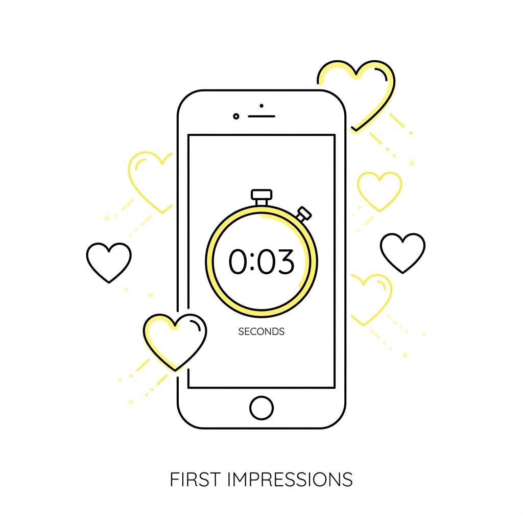
The Speed Dating Reality of Web Browsing
Let's be honest, your website has about 3 seconds to make an impression before users bounce to the next option. That's less time than it takes to say "Hi, I'm single and ready to convert!" In the dating world, this is called speed dating. In the web world, this is called Tuesday.
Your homepage is essentially your dating profile picture. And just like dating apps, if users don't like what they see immediately, they're swiping left faster than you can explain your "unique value proposition." The harsh truth? Most websites are the equivalent of posting a blurry gym selfie with a fish.
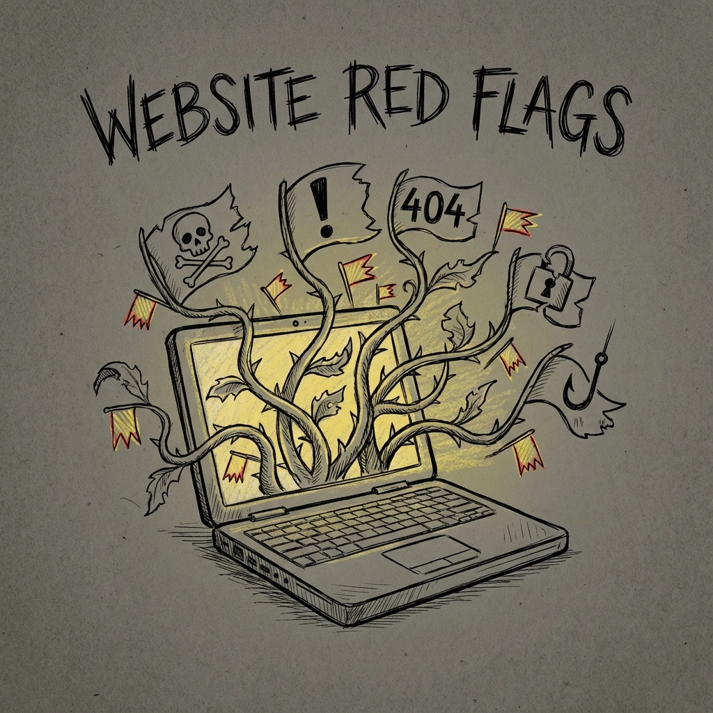
First Date Red Flags: Website Edition
Remember that date who showed up 20 minutes late, talked only about themselves, and then split the check after ordering lobster? Your website might be doing the digital equivalent:
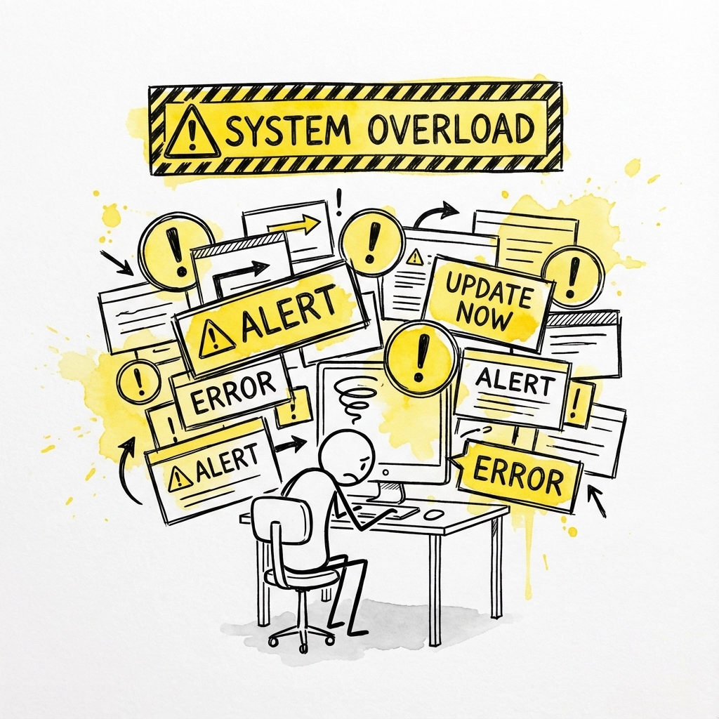
Showing Up Late (Slow Loading Times): If your site takes longer to load than it takes to decide what to watch on Netflix, you're already in trouble. Users expect instant gratification, not a meditation exercise in patience. A slow-loading website is like being late to a first date, it immediately signals that you don't respect their time.
Talking Only About Yourself (Poor User Focus): Does your homepage immediately scream "ME ME ME" instead of "How can I help YOU"? Websites that lead with company history, awards, and founder bios are like dates who spend two hours explaining their CrossFit routine. Nobody cares about your corporate achievements until they know you understand their problems.
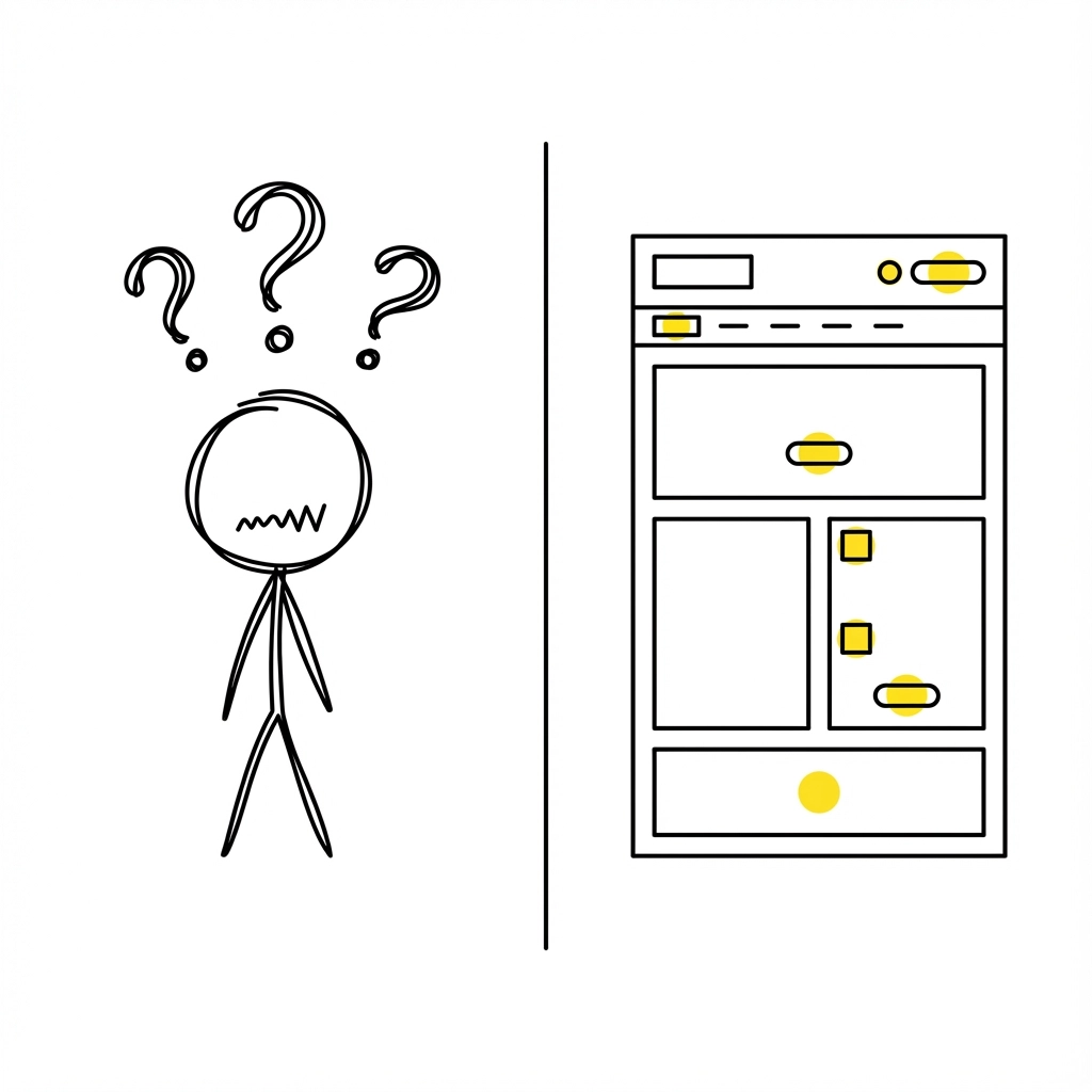
Confusing Communication (Poor Navigation): Ever been on a date where someone speaks in riddles? That's your website when users can't figure out how to find basic information. If finding your contact page requires a treasure map and three cups of coffee, you're doing it wrong.
The "Will They Call Back?" Moment
Every first date has that pivotal moment where you both realize if this is going somewhere or if you're about to become someone's "funny story" for friends. For websites, this moment happens when users decide whether to engage further or hit the back button.
What determines this make-or-break moment? It's not your fancy animations or that video that auto-plays with sound (please stop doing that). It's whether users can immediately answer three crucial questions:
- What do you actually do? (And "synergistic solutions" doesn't count as an answer)
- How will this help me? (Beyond making you rich)
- What should I do next? (And no, "explore our site" isn't helpful)
If your website can't answer these questions within 10 seconds, you're getting ghosted harder than someone who asks to split dessert three ways.
The Compatibility Test: Does Your UX Actually Work?
Here's where the dating metaphor gets painfully accurate. Just like dating, compatibility is everything. You might look great on paper (or pixels), but if the actual experience is painful, nobody's sticking around for dessert.
Good UX is like good conversation: it flows naturally, responds appropriately, and doesn't make people work too hard to understand what's happening. Bad UX is like that date who responds to every question with "I don't know, what do you want to do?"
The Mobile-First Reality Check: In 2024, if your website doesn't work perfectly on mobile, you're essentially showing up to a first date in pajamas. More than half of web traffic is mobile, which means your desktop-only masterpiece is like planning a romantic dinner at a place that's only open on Tuesdays.
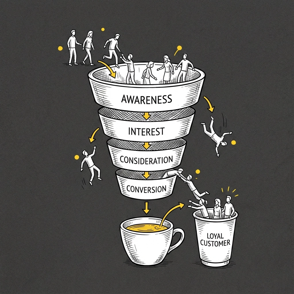
Converting Browsers into Believers
The dating-to-website parallel gets really interesting when we talk about conversion funnels. Think about the natural progression of a successful relationship:
First Contact (Landing Page): Making a good impression and establishing interest
Getting to Know Each Other (Content/Product Pages): Building trust and understanding
Commitment (Conversion): Taking the relationship to the next level
Most websites skip the "getting to know each other" phase and jump straight to "let's get married" (buy our product). This is the digital equivalent of proposing on the first date. Spoiler alert: it doesn't work.
The Art of Not Being Clingy
Nobody likes a clingy date, and nobody likes a clingy website. You know the type: pop-ups that appear before you've even finished reading the headline, newsletter signups that block content, and chatbots that start conversations with "HI THERE! 😊 How can I help you today???" before you've figured out where you are.
The best websites, like the best dates, give users space to breathe and explore. They provide value upfront without immediately asking for something in return. They understand that trust is built through consistent positive experiences, not aggressive pursuit.
Red Flags That Send Users Running
Some website sins are so egregious they're immediate deal-breakers:
Auto-Playing Videos with Sound: The digital equivalent of showing up drunk to a coffee date.
Infinite Scroll with No Footer: Like a conversation that never ends and never goes anywhere.
Stock Photos of People Pointing at Laptops: The visual equivalent of lying about your height on your dating profile.
Pop-ups That Can't Be Closed: Basically digital stalking.
The Follow-Up Game
Just like dating, the initial interaction is only the beginning. What happens after someone visits your website determines whether this becomes a lasting relationship or a one-night bounce rate.
Email marketing is your follow-up text game. Are you sending thoughtful, valuable content that makes people excited to hear from you? Or are you the digital equivalent of "hey" at 2 AM every single night?
Your ongoing content strategy is like planning second, third, and fourth dates. Each piece should add value, build trust, and give people reasons to keep coming back. Nobody wants to date someone who peaked in high school and has nothing new to offer.
Making It Work: The Relationship Advice Your Website Needs
So how do you create a website that doesn't just survive the first date but builds a lasting relationship with users?
Be Genuinely Helpful: Focus on solving actual problems instead of showcasing how clever you think you are.
Respect People's Time: Make everything faster, clearer, and more intuitive than your competition.
Show, Don't Tell: Use case studies, testimonials, and real examples instead of generic claims about being "innovative" or "solutions-oriented."
Keep Evolving: The best relationships grow and adapt. Your website should too.
The Happily Ever After
The truth is, creating a website that truly connects with users isn't about tricks or hacks: it's about building something genuinely useful and then making it as easy as possible for people to benefit from it.
Your website might never find true love, but it can definitely find users who stick around, recommend you to their friends, and come back when they need what you're offering. And in the digital marketing world, that's pretty much the same thing.
At 141 Creative, we've seen enough website first dates gone wrong to know what actually works. We focus on creating digital experiences that users actually want to engage with: no awkward small talk or desperate pickup lines required.
Because at the end of the day, the best websites are like the best relationships: they make everything easier, more enjoyable, and leave people genuinely glad they showed up.
0 Comments