
Ever wonder why Olympic athletes look so dang powerful standing on that podium? Sure, winning a medal helps. But there's something else at play, the psychology of color, positioning, and visual design working together to create that "champion" feeling.
The same principles that make podium moments iconic can transform your brand from forgettable to unforgettable. Whether you're designing a logo, building a website, or creating marketing materials, understanding color psychology isn't just helpful, it's your secret weapon for influencing how audiences perceive and remember you.
Let's break down how the psychology of the podium applies to your brand's visual identity, and why getting your colors right is like training for gold.
The Podium Effect: Why Visual Hierarchy Matters
Think about the Olympic podium for a second. Gold stands highest, flanked by silver and bronze. It's not random, it's intentional visual hierarchy that communicates value instantly, without words.
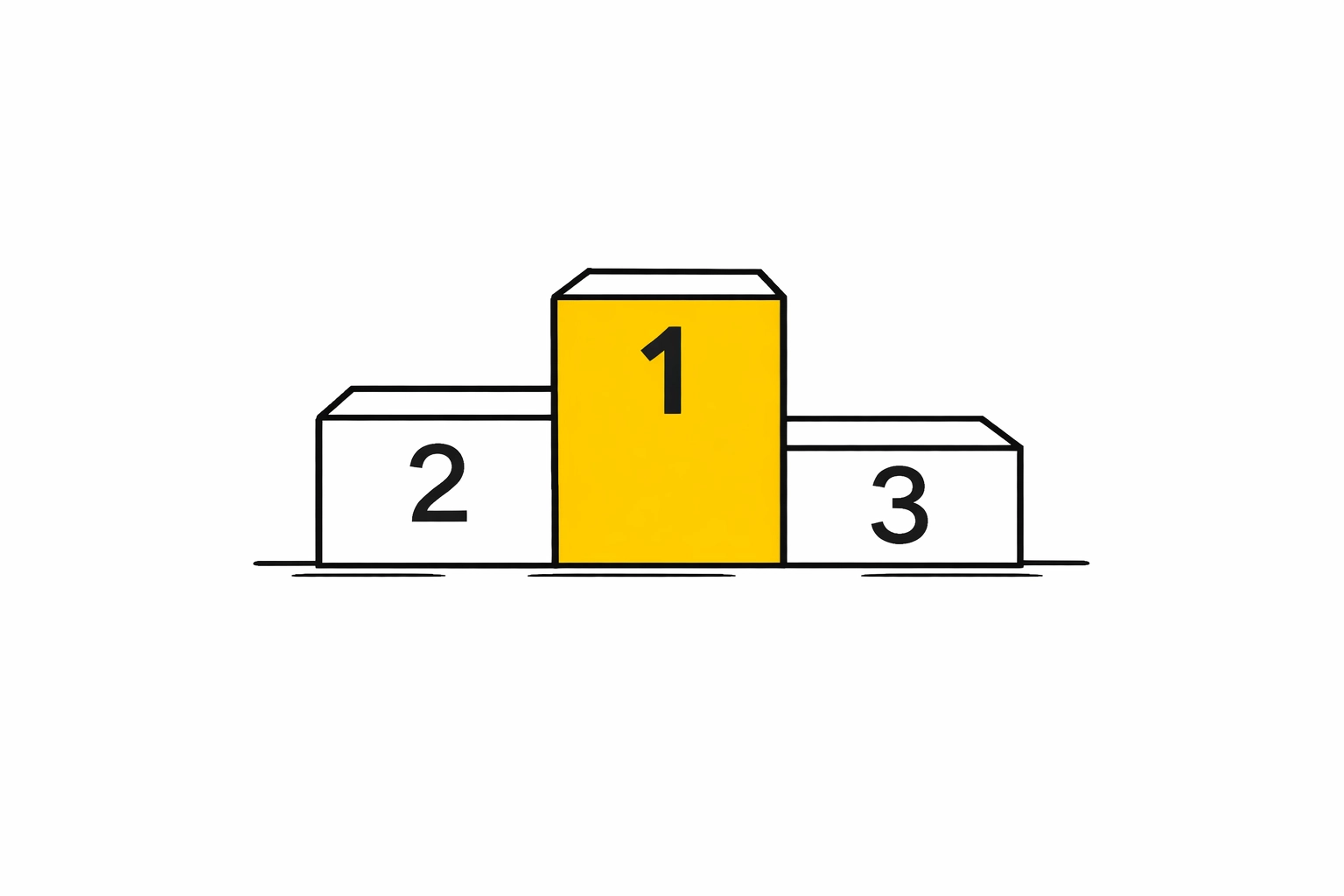
Your brand needs the same strategic thinking. Visual hierarchy guides your audience's eyes to what matters most, whether that's a call-to-action button, your headline, or your company logo. Research shows that podium design significantly influences how audiences perceive speakers and receive their messages. Poor design choices? They can undermine your message entirely, distracting from what you're actually trying to say.
In graphic design, this means:
- Size matters: Your most important elements should literally be bigger
- Position wins: Top and center naturally draw the eye (just like that gold medal position)
- Contrast creates champions: Make your key messages stand out from the background noise
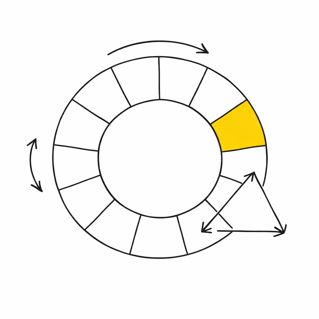
Decoding the Color Medal Count
Let's talk about why those Olympic medals are gold, silver, and bronze, and what it teaches us about color psychology in branding.
Gold = prestige, success, luxury. It screams "winner" because we've been conditioned to associate it with achievement. In branding, warm metallic tones signal premium quality and exclusivity.
Silver = modern, sleek, sophisticated. Think tech companies and innovation. It's the color of the future.
Bronze = earthy, reliable, grounded. Brands using bronze and copper tones communicate authenticity and craftsmanship.
But here's where it gets interesting for your business: you're not limited to podium colors. The entire spectrum is your playground.

The Color Playbook for Brand Dominance
Red grabs attention faster than a false start at the 100-meter dash. It signals urgency, excitement, and action. Think clearance sales, "Buy Now" buttons, and brands like Coca-Cola or Target. But use it sparingly, too much red can feel aggressive or overwhelming.
Blue is the trust MVP. It's why banks, healthcare companies, and social media platforms lean heavily on blue. It evokes calm, reliability, and professionalism. Facebook, LinkedIn, and Chase Bank didn't pick blue by accident, they picked it to make you feel safe.
Green signals growth, health, and relaxation. It's nature's calling card. Whole Foods, Spotify, and Starbucks use green to communicate freshness and sustainability. In 2026, with environmental concerns at an all-time high, green is having a major moment.
Yellow is optimism in color form. It's friendly, energetic, and impossible to ignore. Brands targeting younger audiences or wanting to communicate approachability (hello, McDonald's) make yellow work hard for them.
Purple screams creativity and luxury. It's rare in nature, which makes it feel special. Beauty brands and creative agencies love purple because it bridges imagination and sophistication.
Black equals power, elegance, and timelessness. Luxury brands practically worship black because it lets their products do the talking. Nike, Chanel, and Apple use black to communicate premium quality without saying a word.
Your Brand's Medal Ceremony: Creating Winning Visual Identity
Now that you understand color psychology, let's talk application. Your brand's visual identity is your podium moment, it's where you stand tall and make people feel something.
1. Pick Your Primary Player
Choose one dominant color that represents your brand's core personality. This becomes your gold medal, the color people associate with you immediately. It should appear in your logo, website header, and primary call-to-action buttons.
2. Support with Secondary Shades
Add 2-3 complementary colors that enhance your primary without competing. These are your silver and bronze, supporting actors that add depth and versatility to your brand palette.
3. Consider Your Audience's Psychology
A law firm shouldn't probably deck everything out in hot pink (though hey, disrupt if you want). A children's toy company shouldn't drown in corporate gray. Match your color choices to your audience's expectations and emotional needs.
Ask yourself:
- What feeling do I want to create?
- What action do I want audiences to take?
- How do competitors in my space use color?
- What makes my brand different, and how can color communicate that?
Layout: The Physical Podium of Digital Design
Color gets the glory, but layout design is what puts you on the podium in the first place. Just like a physical podium's height, placement, and accessibility affect how audiences perceive speakers, your website or marketing material's layout affects how people engage with your brand.
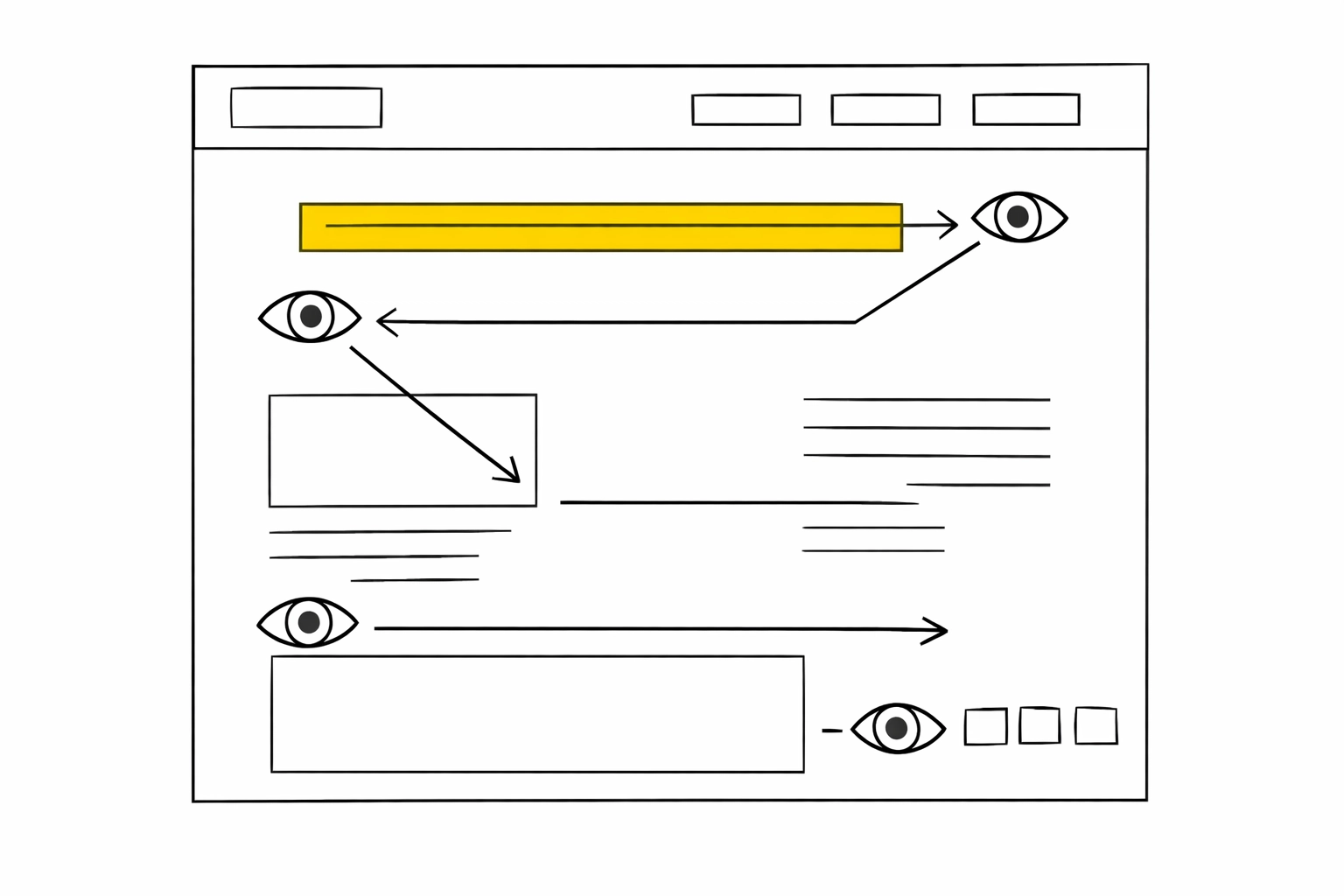
The F-Pattern and Z-Pattern: Eye-tracking studies show people scan content in predictable patterns. The F-pattern works for text-heavy pages (like blogs, hey there!). The Z-pattern works for landing pages with minimal text and clear calls-to-action.
White Space is Your Friend: Cramming everything together is like putting all three medalists on the same tiny platform: confusing and uncomfortable. Give your design elements room to breathe. White space increases comprehension by 20% and makes content feel premium.
Accessibility is Non-Negotiable: In 2026, if your design isn't accessible, you're disqualifying yourself before the race begins. Color contrast ratios matter. Text readability matters. Making sure everyone can access your content regardless of ability? That matters most.
Winter Olympics Edition: Seasonal Color Psychology
Since we're in winter Olympics season (or close to it), let's talk about how seasonal color shifts affect brand perception.
Winter palettes traditionally lean cool: icy blues, crisp whites, deep navy, silver accents. These colors communicate clarity, freshness, and precision. Athletes on winter Olympic podiums are often photographed against stark white snow and bright lights, creating that clean, champion aesthetic.
For brands, incorporating seasonal color psychology means:
- Winter campaigns: Lean into cool tones, metallic accents, and high contrast
- Spring transitions: Introduce pastels and fresh greens
- Summer energy: Amp up warm tones and saturated colors
- Fall grounding: Embrace earth tones and rich, warm hues
Your brand's core colors stay consistent, but seasonal campaigns can play with accent colors to stay relevant and fresh.
Testing Your Way to Gold
Here's the thing about color psychology: it's science mixed with art. What works for one brand might flop for another. That's why testing is crucial.

Run A/B tests on:
- Button colors on your website
- Email header designs
- Social media post styles
- Ad creative variations
Tools like heatmapping software show where users actually click and scroll. Sometimes the "rules" of color psychology surprise you. Maybe your audience responds better to orange than red. Maybe that blue you thought was trustworthy reads as cold.
The podium moments come from testing, learning, and refining.
The Champion's Mindset: Consistency is Key
Olympic athletes don't train once and call it good. Your brand's visual identity needs the same commitment. Once you've established your color palette and design guidelines, stick with them. Consistency builds recognition.
Think of brands you instantly recognize: their colors are burned into your brain. Target's red. Tiffany's blue. McDonald's golden arches. That doesn't happen by accident. It happens through relentless, consistent application across every touchpoint.
Create a brand style guide that documents:
- Exact color codes (hex, RGB, CMYK)
- When to use each color
- Minimum contrast requirements
- Logo variations
- Typography rules
- Design dos and don'ts
Your Podium Awaits
Understanding the psychology behind color and design isn't about following rigid rules: it's about making intentional choices that connect with your audience emotionally. Whether you're redesigning your website, launching a new product, or refreshing your brand identity, remember: every color tells a story, every layout guides behavior, and every design choice is an opportunity to stand taller.
The podium isn't just for Olympic athletes. It's for brands bold enough to understand their audience, strategic enough to use psychology, and consistent enough to build recognition over time.
Now go claim your gold. 🥇
0 Comments