
Let's be honest, your website needs to be more photogenic than a golden retriever wearing sunglasses if you want to survive in today's scroll-happy world. We're living in the age where people judge your entire business based on how your homepage looks in a screenshot. No pressure, right?
But here's the thing: creating an "Instagrammable" website isn't just about slapping some pretty colors together and calling it a day. It's about crafting a digital experience so visually delicious that people can't help but share it with their friends, followers, and that one cousin who always comments "Nice!" on everything.
What Makes a Website Actually Share-Worthy?
Think about the last time you screenshotted a website to share with someone. Was it because of the incredible functionality of their contact form? Probably not. You shared it because something about that site made you go "Whoa, this is cool!"
The secret sauce isn't rocket science, it's about creating moments of visual delight that make people want to hit that share button faster than they swipe left on dating apps. We're talking about websites that make people pause their endless scroll and actually pay attention.
Your website needs to be the digital equivalent of that perfectly curated coffee shop that everyone wants to visit just to get the perfect shot for their Story. You know the one, exposed brick, neon signs, and plants that somehow always look perfect despite probably being plastic.
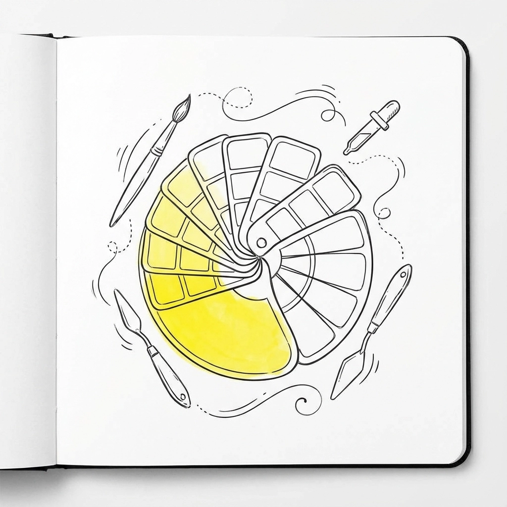
Color Me Impressed: The Psychology of Share-Worthy Palettes
Color isn't just decoration, it's psychology in pixels. The right color combination can make your website feel like that friend who always knows what to say, while the wrong one makes it feel like small talk at a DMV.
High contrast is your best friend here. Think black text on white backgrounds, or bold, saturated colors that practically jump off the screen and demand attention. Muted pastels might look sophisticated in your living room, but they're about as exciting as watching paint dry when it comes to social sharing.
Here's a pro tip: limit yourself to 2-3 main colors max. Any more than that, and your site starts looking like a unicorn exploded. Consistency is key, your color palette should flow through every element like a perfectly curated Instagram feed.
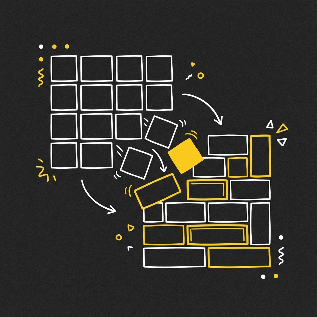
Layout Like You Mean It
Clean, minimal layouts aren't just trendy, they're necessary for survival in our attention-deficit world. Your website needs to guide visitors' eyes like a well-designed museum, not overwhelm them like a garage sale.
Visual hierarchy is crucial. Your most important content should be as obvious as a flamingo in a flock of pigeons. Use white space generously, it's not wasted space, it's breathing room. And for the love of all things holy, make sure your images load faster than your impatience during a Netflix buffer.
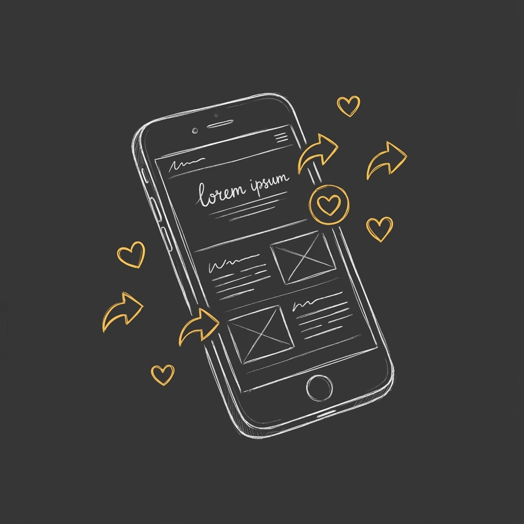
The Instagram Wall: Your Secret Weapon
Want to know what's more powerful than testimonials? Real people actually using and loving your stuff. Instagram Walls are like having a 24/7 focus group showcasing how awesome your brand is, except these people are doing it voluntarily (and usually with better lighting).
An Instagram Wall pulls in posts from your hashtags or curated selections, turning your website into a living, breathing gallery of social proof. It's like having a constant stream of "Look how cool this brand is!" content that updates itself.
Choose your layout wisely, grid layouts feel organized and professional, carousel styles encourage exploration, and masonry layouts add that modern, Pinterest-worthy aesthetic. The key is matching the style to your brand personality. Are you structured and reliable? Go grid. Are you creative and dynamic? Masonry might be your jam.
Content That Clicks (Literally)
Creating shareable content is like being a good storyteller, you need to know what makes people lean in and listen. Your visuals should tell a story that people want to be part of.
Think bold product shots that showcase your stuff in action, behind-the-scenes glimpses that make people feel like insiders, and user-generated content that proves real people actually love what you do. If you're feeling fancy, throw in some custom illustrations that are so uniquely you that people recognize your style from across the feed.
Seasonal content rotation is your friend here. Nothing says "we're paying attention" like fresh content that actually reflects what's happening in the world. Summer vibes in December? That's a no from us, dawg.
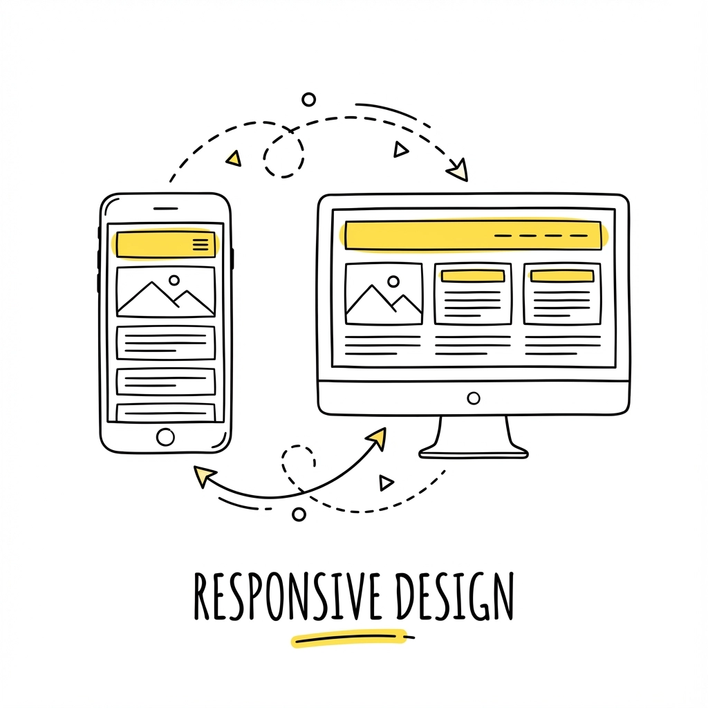
The Mobile-First Reality Check
Here's a reality check: most people are going to see your website on their phones first. If your site looks like it was designed in 2010 on a smartphone screen, those potential shares are going to turn into swift exits.
Square formats (1080x1080px) and vertical dimensions (1080x1350px) are the social media darlings right now. They prevent that awkward cropping situation where half your brilliant design gets chopped off, leaving people confused about what they're actually looking at.
CTAs That Don't Suck
Your call-to-action buttons shouldn't feel like that friend who only calls when they need something. They should feel natural, helpful, and genuinely valuable.
Instead of boring "Click here" buttons, try something with personality: "Get the good stuff," "Yes, I want to be awesome," or "Start my transformation." Make people feel like they're joining something special, not just filling out another form.
Interactive elements are where the magic happens: polls, suggestion boxes, comment sections that people actually want to engage with. Ask questions that matter: "What's your biggest challenge with [your industry problem]?" or "Tag someone who needs to see this!"
Navigation That Actually Works
Good navigation is like good manners: you only notice when it's missing. Your visitors should be able to find what they're looking for without needing a map, a compass, and three cups of coffee.
Breadcrumbs aren't just for Hansel and Gretel: they help users track their journey and feel confident exploring your site. Clear menu structures, logical page hierarchies, and search functions that actually work are the difference between a pleasant browse and a frustrated bounce.
The Performance Factor
Nothing kills the sharing mood faster than a website that loads slower than molasses in January. Your amazing visuals mean nothing if people give up before they even see them.
Optimize those images like your conversion rates depend on it (because they do). Compress files, use appropriate formats, and always include descriptive alt text: it's good for SEO and shows you actually care about accessibility.

Measuring Your Instagrammable Success
The best Instagrammable websites don't just look good: they perform. Track your engagement rates, click-through rates, and referral traffic to see what's actually working versus what just looks pretty.
Use analytics to understand which elements people engage with most. Are they screenshotting your pricing page? Sharing your about section? Spending forever on your portfolio? This data tells you what's resonating and what needs work.
The Bottom Line
Creating an Instagrammable website isn't about following every trend or making everything so pretty it hurts to look at. It's about creating genuine moments of delight that make people want to share your brand with their world.
Your website should be the digital equivalent of that friend who always knows the coolest spots in town: effortlessly cool, genuinely helpful, and worth talking about. When you nail that combination of stunning visuals, seamless functionality, and share-worthy moments, you're not just building a website: you're building a brand experience that people actually want to be part of.
Remember, in a world where everyone has a camera and an opinion, being Instagrammable isn't just nice to have: it's essential. So go forth and create something so visually delicious that people can't help but hit that share button. Your future viral moment is waiting.
0 Comments