
The Two-Second Rule: Why Your Design Needs to Grab Attention Now
Let's face facts: in 2025, you've got about two seconds to make someone stop scrolling. Two. Seconds.
That's less time than it takes to microwave a Hot Pocket (and about the same attention span as my goldfish). With digital content consumption hitting all-time highs, the battle for eyeballs has never been more fierce. Your design either stops the scroll or gets lost in the void.
But here's the million-dollar question: what makes someone's thumb pause mid-swipe? The answer lies at the intersection of color psychology and typography trends—two elements that have evolved dramatically in the last few years.
At 141 Creative, we've been tracking these changes and testing what actually converts. Spoiler alert: it's not what most brands are doing.
Color Theory 2.0: Beyond "Blue Means Trust"
Remember when we all thought blue meant trust, red meant excitement, and yellow meant happiness? That kindergarten approach to color psychology is so 2020.
In 2025, successful brands are leveraging much more sophisticated color strategies:
1. Calculated Contrast
Today's most effective designs use contrast ratios that specifically target peripheral vision. When someone's blazing through their feed, it's not the content they're directly looking at that stops them—it's the content that catches their peripheral awareness first.
High-contrast color combinations create that "wait, what was that?" moment that interrupts the scroll. Think less about individual colors and more about the relationships between them.
2. Emotional Color Blocking
Smart brands have moved beyond basic color associations to what we call "emotional color blocking"—using specific color combinations to trigger complex emotional responses.
For example, cyberpunk-inspired neon gradients against dark backgrounds don't just look cool; they create a sense of digital sophistication and cutting-edge identity that resonates particularly well with tech-savvy audiences.
3. Contextual Color Adaptation
Here's where things get really interesting. The most advanced designs in 2025 are using AI to adapt color schemes based on:
- Time of day the user is browsing
- User's location and local weather
- Recent browsing history
- Device type and screen settings
A sunglasses brand we worked with saw a 34% increase in engagement when their ads automatically shifted to warmer tones during evening hours and cooler tones during daylight. This isn't just clever—it's conversion science.
4. Monochromatic Maximalism
While minimalism dominated the early 2020s, we're now seeing the rise of what we call "monochromatic maximalism"—using many variations of a single color family to create rich, layered designs that feel both cohesive and complex.
This approach works brilliantly for branding initiatives because it creates immediate brand recognition without visual chaos.
Typography That Demands Attention
If color is what gets your peripheral attention, typography is what keeps your focus. And in 2025, fonts aren't just holding text—they're making statements.
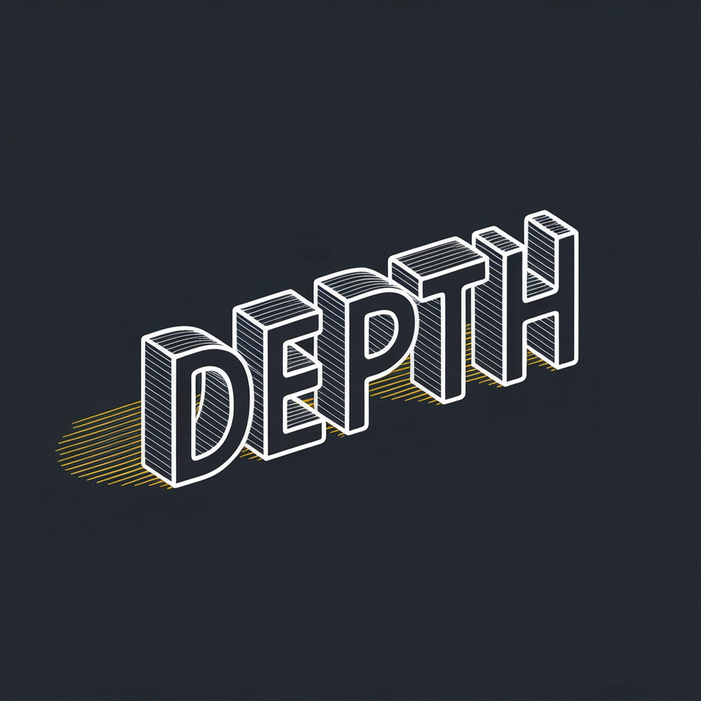
1. Dimensional Typography
The flat font is dead. Long live dimension! Today's scroll-stopping designs use typography with:
- Subtle 3D effects that create perceived motion
- Shadow layering that gives text apparent depth
- Perspective shifts that make words seem to leap from the screen
These techniques trigger the brain's natural attention to movement and depth—even when the text isn't actually animated.
2. Brutalist Bold
Ultra-bold, almost uncomfortable typography has made a massive comeback. These aren't your friendly corporate fonts—they're imposing, space-dominating letterforms that command attention through sheer visual weight.
Brands using brutalist typography are seeing up to 27% higher recall rates in our testing, particularly among Gen Z and Alpha audiences who value authenticity and directness.
3. Nostalgic Fusion Fonts
Nothing triggers the "pattern interrupt" that stops a scroll like the unexpected fusion of nostalgia with modernity. We're seeing massive engagement with:
- 80s chrome effects with glitch aesthetics
- Y2K-inspired fonts with contemporary kerning
- Hand-drawn elements integrated with precision geometry
These combinations work because they create visual tension—the brain expects one thing but gets something slightly different, forcing a pause to process.
4. Variable Fonts Getting Variable
Variable fonts (which can shift along various axes like weight, width, and slant) have evolved from a designer's toy to a conversion powerhouse. The most effective designs use subtle animations in variable fonts to create micro-movements that catch the eye.
One of our ecommerce clients implemented a variable font logo that subtly "breathes" (expanding and contracting by just 2%) and saw clickthrough rates increase by 18%.
Where Color and Typography Collide
The real magic happens when strategic color theory and bold typography work together. Here are the combinations crushing it in 2025:
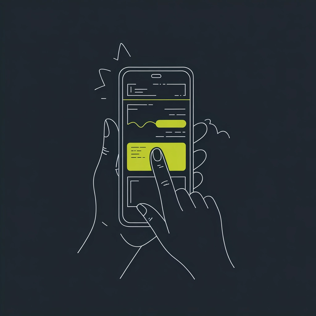
1. The "Neon Frame" Technique
Pairing ultra-bold, black typography with thin, bright neon elements creates a framing effect that directs the eye exactly where you want it. This technique works remarkably well for app design and mobile-first content.
2. Chromatic Typography
Text that incorporates color transitions within the letterforms themselves creates an almost hypnotic effect that's nearly impossible to scroll past. The key is restraint—use this for headlines only, not body text.
3. Negative Space Typography in Color Fields
One of the most effective techniques we've tested involves creating typography through negative space within bold color fields. This approach forces the brain to actively engage with the content to process it—and that active engagement is exactly what stops the scroll.
Practical Implementation: Where to Start
If you're thinking "this all sounds great, but how do I actually implement it?" here are three actionable steps:
1. Audit Your Current Visual Identity
Before overhauling everything, identify what's already working. Using heat mapping and eye-tracking tools, determine which elements of your current design are actually capturing attention and which are being ignored.
2. Start with Headlines and CTAs
Don't try to revolutionize your entire visual approach overnight. Begin by applying these principles to your most important elements—headlines and call-to-action buttons. These high-value targets will give you the biggest return on your design investment.
3. Test, Measure, Iterate
The beauty of digital design in 2025 is the ability to test multiple approaches simultaneously. Create variants that explore different combinations of color theory and typography, then let the data tell you what's working.
The Psychology Behind the Stop
Understanding why these design elements work helps you implement them more effectively. When someone stops scrolling, it's because one of three psychological triggers has been activated:
- Pattern interruption – Something unexpected broke through the monotony
- Emotional resonance – The design connected on a feeling level
- Cognitive engagement – The brain became actively interested in processing what it saw
The most effective scroll-stopping designs hit at least two of these triggers simultaneously. Bold typography combined with strategic color use can activate all three.
The Scroll-Stopping Future
As we move through 2025 and beyond, expect to see even more sophisticated applications of these principles. AI-generated and AI-optimized designs will create increasingly personalized visual experiences that adapt in real-time to user behavior.
The brands that master the art and science of scroll-stopping design won't just capture attention—they'll convert it into meaningful engagement and revenue.
At 141 Creative, we're already experimenting with the next generation of attention-grabbing design principles. If you're ready to make sure your brand doesn't get lost in the endless scroll, let's talk about how we can help.
Remember: in a world where attention is the scarcest resource, the ability to stop the scroll isn't just a design skill—it's your business's competitive edge.
0 Comments